When creating content, it’s best practice to ensure your posts are sized correctly for the social media platform you’re publishing to. Instagram is gradually phasing out its iconic 1:1 grid in favor of a more creator-friendly 4:5 ratio. With the growing popularity of reels and the influx of vertical (non-video) content on the platform, this drastic shift makes sense. Additionally, Instagram expanded the number of photos and graphics in a carousel post from 10 to 20 frames, offering more flexibility in content presentation.
What do these changes mean for those who aren’t content creators? What processes or strategies should your marketing team start implementing? And if you, as an Instagram user, haven’t received the grid update yet, how can you prepare for the full 4:5 integration? We’ll break down everything you need to know to make the most of these updates.

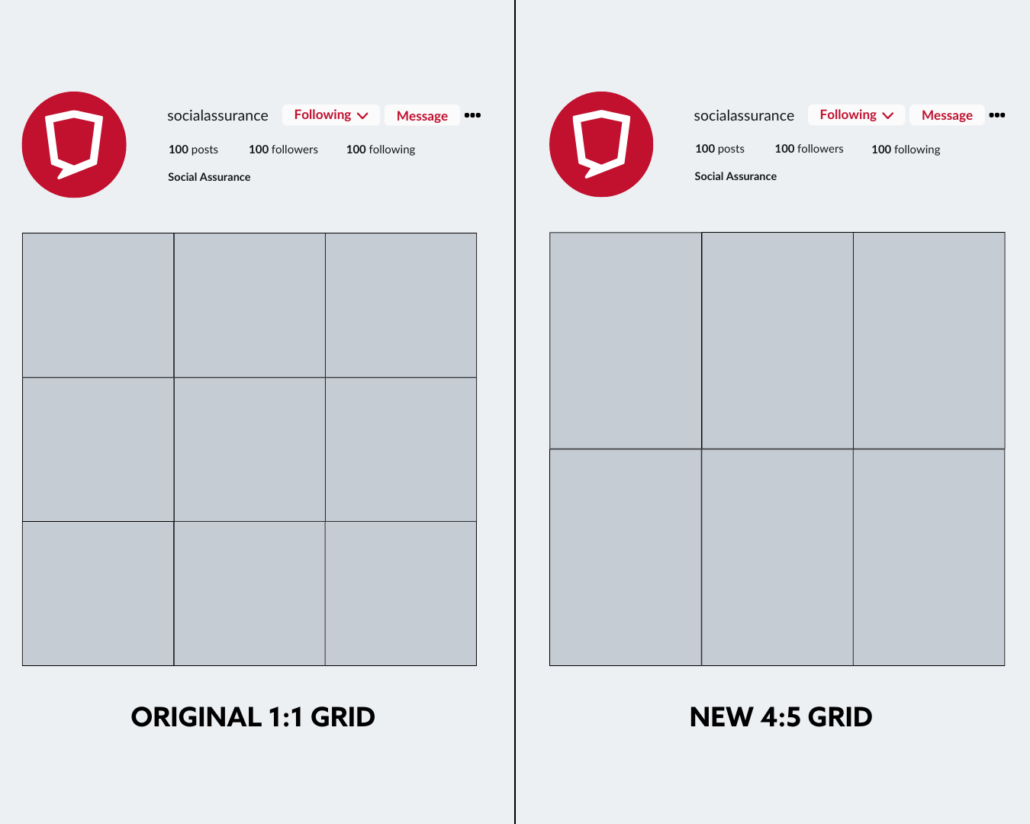
Instagram is shifting from the traditional 1:1 grid (left) to a new 4:5 ratio (right), impacting how your profile feed will display. These mockups show the anticipated visual changes when followers visit your page.
The Impact of 4:5 on Existing Content
When Instagram users visit your government office of agency’s profile, they see all your public posts arranged in a grid. For many, maintaining a cohesive grid layout is important. While it might seem trivial, a well-organized grid often sets professionals and amateurs apart.
Those who tailored their content to fit the 1:1 ratio may notice their grid doesn’t look quite as polished with the new 4:5 ratio. Once the update is fully integrated, all posts published prior will be automatically stretched to conform to the new 4:5 sizing. This adjustment can result in awkward cropping of graphics and photos, potentially disrupting the visual harmony of your profile.
A disjointed grid can undermine the trust and professionalism your organization seeks to convey, making it harder to convert profile visitors into leads, account openings, and other key actions. For government entities, especially those targeting Gen Z and millennial citizens, ensuring your grid remains visually cohesive is essential for driving engagement.
Maximizing Your Carousel Potential
Some users fall short when it comes to using carousels to their fullest. A carousel is a feature that lets you include multiple photos, videos, and graphics in a single post, allowing your audience to swipe through them. Long before carousels were introduced, users across the platform faced challenges with cramming a lot of information into a single graphic, choosing the best photo from an event, or hoping a video could capture the full story.
Now, with up to 20 frames at your disposal, you can effectively distribute information in an engaging way using a mix of photos, graphics, and videos. For instance, if you’re creating a post about a big-picture project with multiple facets and points of impact, you could use multiple frames to break down the information. Dedicating 3-4 frames to different categories of terms, using engaging visuals and smaller snippets of information helps your audience more readily absorb and retain these types of updates.
How to Move Foward
While the carousel update is accessible to all users, the 4:5 grid is slowly making its way across users on the platform. During this interim period, what can you do to make sure your posts look cohesive? What habits should you implement within your team when it comes to creating content?
For teams and individuals tasked with social content, a habit must be built to take a few vertical photos and videos when obtaining content for socials. While it’s great to get content that’s flexible and fits within the criteria for all the platforms government offices and organizations are on, Instagram is now a special use case. Emphasizing the need for taking both vertical and horizontal on a shot list is crucial, even though with current 1:1 ratios, it’ll be a relief to see any future materials seamlessly change into the 4:5 grid.
The most tedious, but crucial, adjustment will be with graphic design. Designs should be created as a 4:5 ratio while ensuring that all information fits well within the current 1:1 grid until the transition is complete. While this may be extra work, it prevents your grid from appearing awkward and ensures that all necessary icons and text are effectively displayed.
We know an update like this can feel tedious ad stressful. Adapting content to fit new formats and features, like expanded carousels, requires careful planning and execution. A central, secure platform for managing all your government social media pages across channels (including planning and scheduling content, sourcing photos and information from field teams, and moderating comments and follower engagement), saves time and keeps you organized. With easy workflows and approvals, it also makes it easier to oversee consistency on designs for Instagram (and other channels). Interested in learning more about how it works? Follow the link below to get in touch.

